If you’re anything like me, you’ve probably found yourself inspired (or even a little envious) while scrolling through some of the best e-commerce website designs on the internet.
With so many top e-commerce websites setting the bar higher every year, it’s clear that good looks alone aren’t enough.
Smart navigation, creative branding, and rock-solid e-commerce SEO all play their part.
In this article, I’ll take you through what makes these sites tick, from must-have features like mobile responsiveness and trust signals, to in-depth examples of brands that truly stand out.
Whether you’re looking to refresh your own store or just want some ideas from industry leaders, you’ll find plenty of practical takeaways and fresh inspiration right here.
Key Features of Winning Ecommerce Website Designs
User-Friendly Navigation and Accessibility
If there’s one thing all top ecommerce sites have in common, it’s how effortlessly you can find your way around. Smart brands set up their menus and categories so even a first-time visitor feels instantly comfortable, never left wondering where to click next.
The search function is easy to spot and does its job well, giving relevant results without fuss.
For those with different needs, features like alt text, keyboard navigation, and high-contrast modes make sure everyone enjoys a seamless journey. Simple touches, like sticky headers or quick links, go a long way in making online shopping accessible for all.
Mobile Responsiveness and Speed
Nowadays, most people do their browsing and shopping on the go, and that’s why mobile-friendliness is essential.
The best ecommerce websites adapt fluidly to any screen size, maintaining their beauty and functionality whether you’re on a laptop, phone, or tablet.
Pages load in a flash, letting you scroll through products or check out without lag or frustration.
Site speed matters, especially when customers are making split-second decisions. If a site’s too slow, shoppers will just move on, but if it’s quick and responsive, it keeps them coming back for more.
Visual Appeal and Brand Personality
Let’s be honest, people are drawn to sites that look good and feel unique. Outstanding ecommerce platforms use striking visuals and cohesive color schemes to express their brand’s personality from the very first click.
High-quality photos, creative graphics, and thoughtful layout choices help tell the brand’s story and build an emotional connection.
Every element, from fonts to icons, works together to create a vibe that’s both memorable and inviting, making the whole experience more than just a transaction.
Persuasive Product Pages and Calls-to-Action
A winning product page does more than show you what’s for sale; it answers your questions and inspires you to take action.
Detailed descriptions, clear sizing charts, and multiple images from different angles provide all the information you need to feel confident about your purchase.
Calls-to-action are front and centre, guiding you smoothly from browsing to buying without feeling pushy. Clever microcopy and visual cues help keep you engaged, while thoughtful cross-selling or upsell prompts nudge you toward a fuller basket, making sure nothing feels forced.
Trust Signals, Reviews, and Social Proof
Trust is the secret sauce for ecommerce success. Shoppers want reassurance, and the best websites provide it with transparent returns policies, visible contact details, and secure checkout badges.
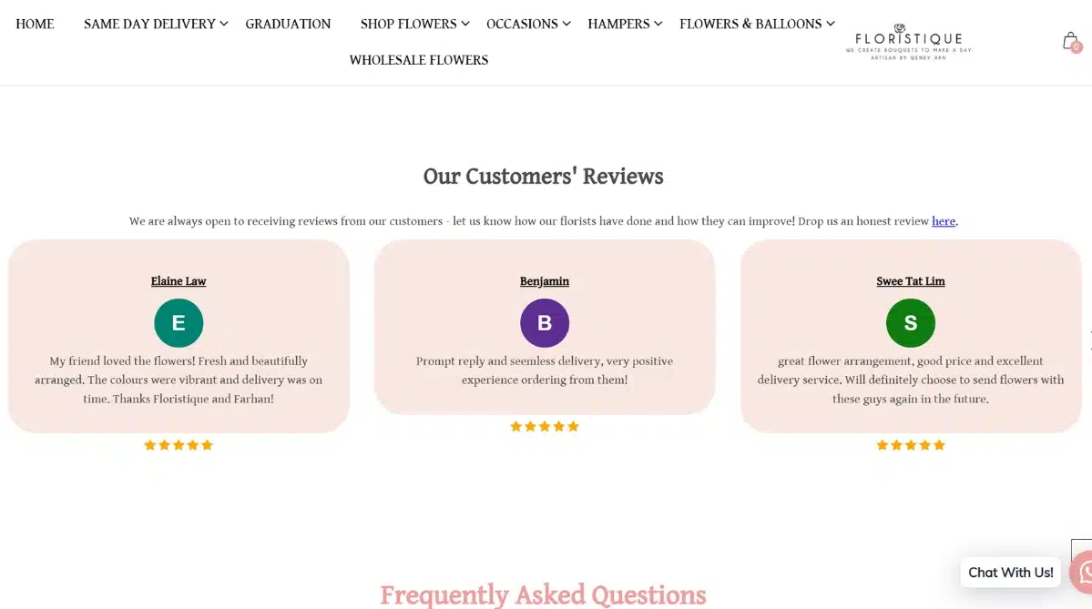
Customer reviews, star ratings, and real-life user photos help you see what others think, making it easier to decide.
Featuring testimonials or even awards adds credibility, while showcasing a strong community vibe through social media or user-generated content builds a sense of belonging.
When a site feels trustworthy and open, shoppers are more likely to click “buy now” with confidence.
Inspiring Ecommerce Website Design Examples (2025 Edition)
ASRV
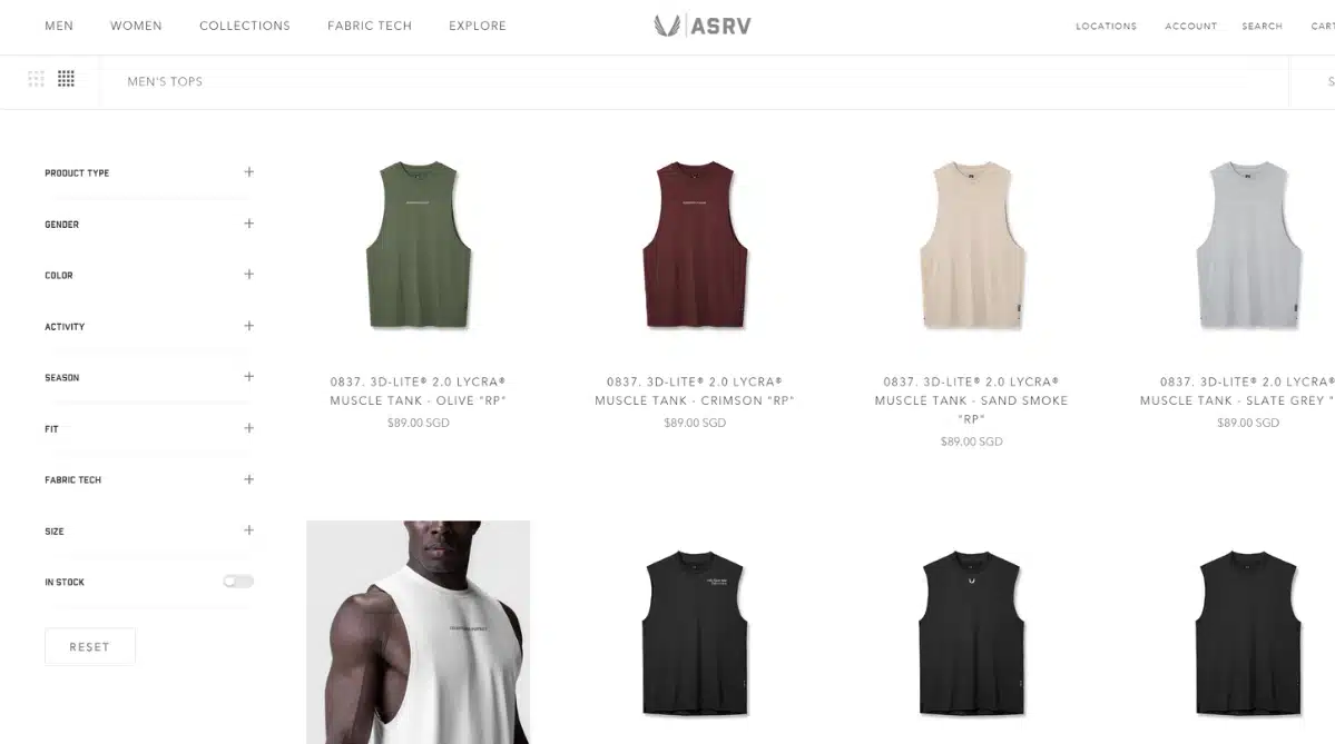
When I explore ASRV’s website, I immediately notice how fresh and focused everything feels. The design is modern, keeping things minimal but never boring, with plenty of clean space so every product truly pops off the screen.
I love how the site uses high-quality, dynamic visuals.
Whether it’s a detailed shot of their Aerotex shorts or a video of someone powering through a workout, every image feels like it belongs in an athletic magazine. Navigating the collections is super intuitive; all the filters and menus make it easy for me to find exactly what I want without any hassle.
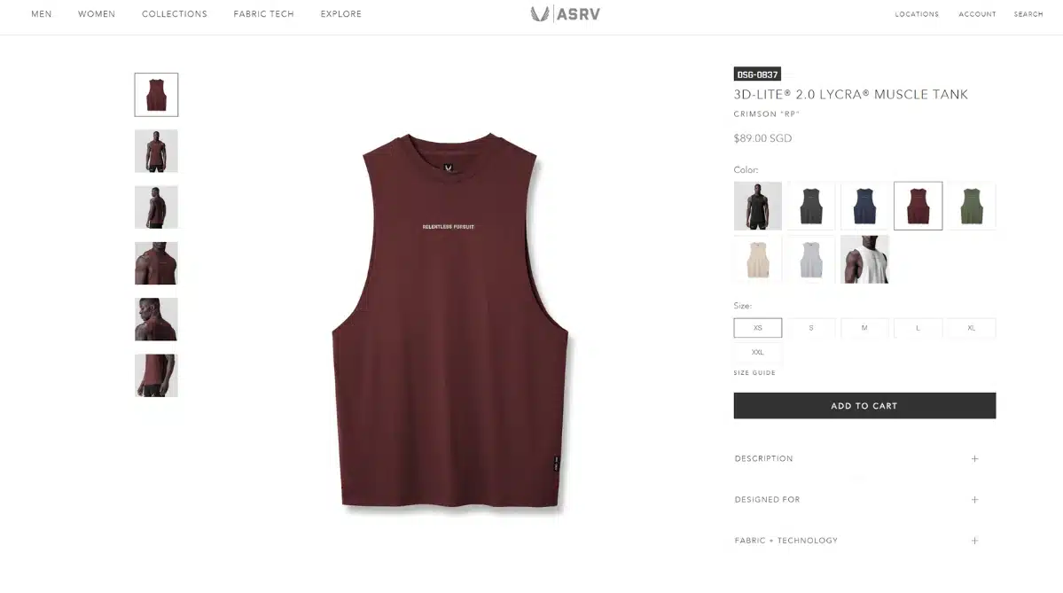
Even the product pages are thoughtfully laid out, letting me check out different colors and sizes in just a few clicks. The whole vibe is high-performance, but still inviting, which makes me want to dig deeper and see what else they have to offer.
Standout features
- Modern minimalist layout with lots of white space
- Striking product and lifestyle imagery
- Smart navigation and filtering for a seamless user experience
Allbirds
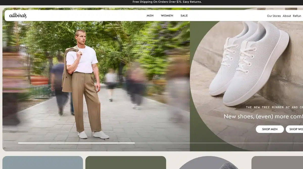
Allbirds is a shining example of how a brand can weave sustainability into every corner of its digital presence.
The site instantly sets a gentle, earthy mood with its calming colours and straightforward design, letting the eco-friendly message shine through without fuss. Shopping here feels natural; categories are clear, pages load swiftly, and information about materials and environmental impact is always at your fingertips.
There’s no wasted time or confusion, which makes browsing feel both responsible and relaxing. You come for the shoes, but you stay for the reassuring sense of trust and transparency that’s hard to fake.
Standout features
- Nature-inspired, minimalist interface
- Crystal clear, accessible navigation
- Honest and informative product storytelling
Bang & Olufsen
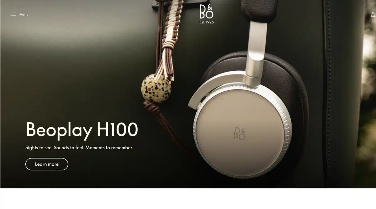
Bang & Olufsen’s website is a masterclass in digital luxury. From the first click, you’re welcomed by sleek visuals and immersive animations that capture the spirit of the brand’s premium sound and design.
Every image feels purposeful, and interactive elements allow visitors to experience products in new, creative ways.
Even the finer details, like micro-interactions and fluid transitions, contribute to an experience that feels crafted and elegant. It’s a perfect blend of sophistication and usability, proving that beauty and function can go hand in hand online.
Standout features
- High-impact, immersive product imagery
- Interactive elements for deeper product exploration
- Refined and consistent visual identity
Solo Stove

Solo Stove keeps things straightforward, focusing on what matters most: connecting with outdoor lovers and getting them inspired to build their own adventures.
From the moment you land on their site, you’re greeted with powerful lifestyle images that make you want to pack your bags and head out camping. The navigation is remarkably clear, so there’s no hunting around for product info or getting lost in complicated menus.
Calls-to-action are impossible to miss, always guiding you to learn more, shop, or join the community. It’s the kind of online experience that proves simplicity and clarity don’t have to be boring.
Standout features
- Strong lifestyle visuals
- Uncomplicated, intuitive navigation
- Highly visible calls-to-action
Floristique

Floristique’s website brings a breath of fresh air to online flower shopping, using soft pastel colors and gentle layouts that make you feel instantly at home.
As soon as I land on the homepage, I’m greeted by elegant arrangements framed with natural light, giving the whole site a welcoming and uplifting vibe. Each bouquet is presented with care, against cozy backdrops that highlight the artistry and freshness of the flowers.
Navigation is a breeze, thanks to clear menus and thoughtful categorization for occasions, hampers, and even same-day delivery. The product pages are informative yet warm, blending poetic descriptions with practical details so I can shop confidently and get inspired by the many options.
Floristique’s site not only captures the charm of a local Singaporean florist but also makes it easy and delightful to share a little beauty with someone special.
Standout features
- Soft, pastel-driven color palette
- Inviting photography with natural light
- Friendly and intuitive navigation
- Detailed yet approachable product pages
Burrow
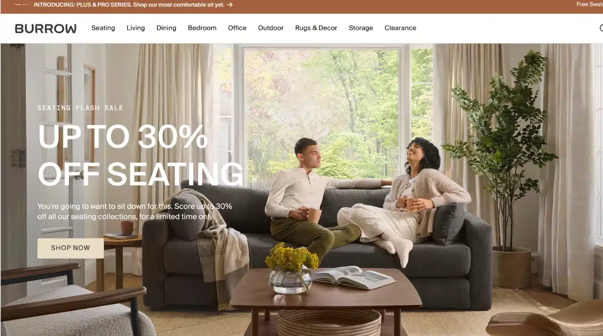
Burrow takes the stress out of furniture shopping with a site that’s smart, modern, and refreshingly user-friendly.
High-quality photography lets every sofa, chair, or table shine, and each product page gives you the information you need in a way that’s clear and inviting. You don’t have to squint or guess; everything from colour options to measurements is right there, making comparison easy.
The site’s flow feels natural, encouraging you to explore without ever feeling overwhelmed. It’s a brilliant example of how digital design can transform a big purchase into a pleasant, confident decision.
Standout features
- Crisp, attractive product imagery
- Intuitive comparison and shopping flow
- Clear presentation of product details
Gymshark
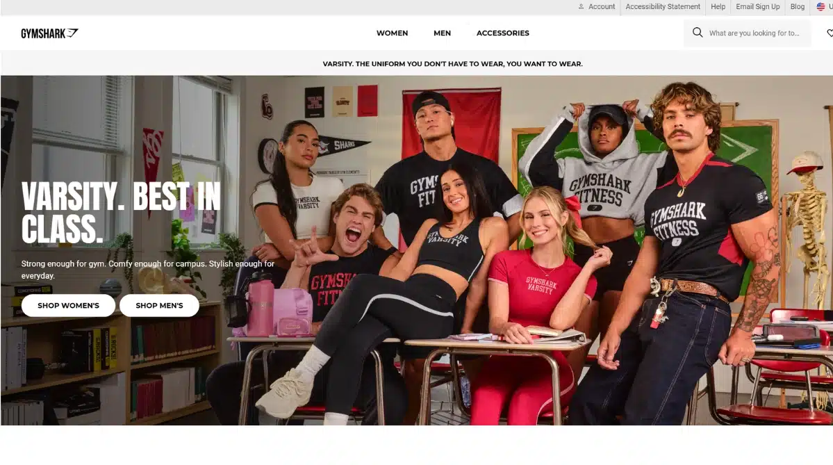
Gymshark has created a digital space that matches the energy and passion of its community. You’ll notice their strong, confident branding right away, with every element supporting an active, aspirational lifestyle.
They don’t just sell sportswear; they celebrate their fans through real stories, user-generated content, and seamless social integration. The site adjusts beautifully to any screen size, which makes it easy for shoppers to stay connected whether they’re at home or on the go.
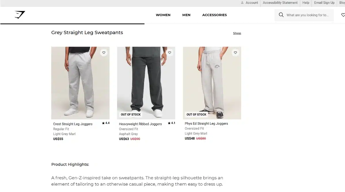
The standout feature for me is the conversion rate optimisation (CRO) elements they’ve built into their blog pages. If you look at their men’s style guide for grey sweatpants, they have content modules that list the products and are linked to their corresponding product pages. This makes it more enticing for users to click into product page links and learn more about them.
The bold visuals and focused layout keep things exciting without ever becoming overwhelming, creating an online experience that’s as motivating as a good gym session.
Standout features
- Powerful, recognisable branding
- Integration with social platforms and community content
- Highly responsive across devices
- Product pages optimised for CRO
The Sill
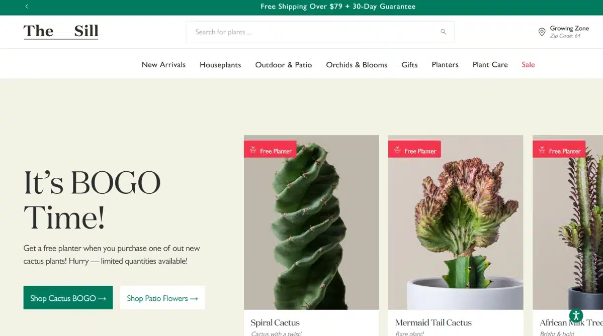
The Sill’s website feels like a breath of fresh air, welcoming you with gentle colours, organic shapes, and easy-to-follow layouts inspired by nature itself.
Each product page reads almost like a friendly guide, offering care tips and background details that make plant shopping feel educational and enjoyable.
Instead of just selling greenery, The Sill creates a supportive space for people new to plants, demystifying the process and encouraging everyone to bring more life into their homes. This nurturing vibe comes through in every interaction, making the site perfect for anyone who wants to learn as much as shop.
Standout features
- Soothing, nature-inspired visual theme
- Educational content woven throughout the site
- Inviting, beginner-friendly design
Heckin Unicorn

Heckin Unicorn’s website just bursts with character, making it impossible not to feel the brand’s playful, unapologetic spirit from the very first scroll.
I’m drawn to the bold, hot pink backdrop and lively graphics that instantly set an inclusive and joyful tone. Everything from the quirky mascot to the cheeky copy feels authentic and inviting, especially for shoppers in the LGBTQIA+ community and their allies.
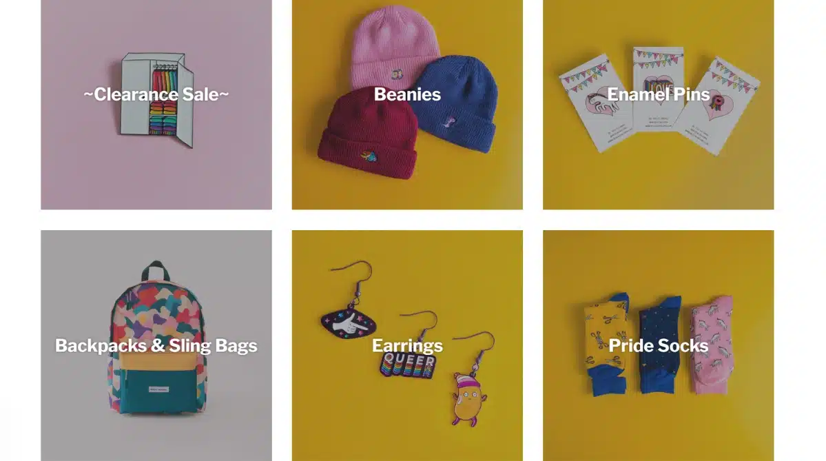
Browsing is a breeze with clear product categories and vibrant filters, and I can’t help but smile at how easy it is to discover pins, socks, and accessories tailored for every identity.
Each product pops against those solid color backgrounds, and the direct, conversational language makes the experience feel more like chatting with a friend than simply making a purchase.
Heckin Unicorn’s site radiates warmth and pride, offering a safe and welcoming space that puts community and positivity front and center.
Standout features
- Bold, energetic color palette
- Clear, inclusive navigation
- Distinctive branding and approachable tone
Glossier
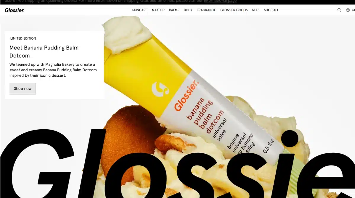
Glossier is all about less is more, and their website shows just how beautiful simplicity can be.
Crisp images, plenty of white space, and straightforward navigation put the focus squarely on their products and the people who love them.
Community is at the heart of Glossier’s digital presence, with customer reviews, real-life photos, and engaging stories bringing authenticity to every page.
Mobile users get a flawless experience too; the site’s design and features adapt perfectly to smaller screens without losing any of its appeal. Shopping here feels effortless, genuine, and refreshingly inclusive.
Standout features
- Minimalist aesthetic with impactful visuals
- Emphasis on user and community stories
- Outstanding mobile user experience
Skullcandy
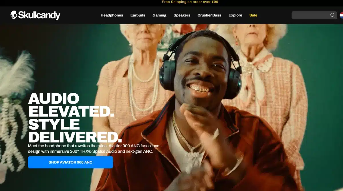
Skullcandy’s website bursts with energy the moment you arrive, drawing you in with its vivid colours and lively graphics.
The site delivers an almost electric vibe, matching the boldness of their audio products and making the whole experience feel fresh and exciting. Everything is designed to keep your attention on what matters most: the products themselves.
Navigating through the different headphones and accessories is a breeze, with visuals and calls-to-action that never let you get lost or distracted. It’s this playful, confident design that gets shoppers hyped up and ready to hit “add to cart”.
Standout features
- Bright, eye-catching colour schemes
- High-energy visuals and graphics
- Clear, product-focused navigation
Ready to Transform Your Online Store?
After exploring these best e-commerce website designs and breaking down what sets the top e-commerce websites apart, it’s clear that a winning site blends:
- Stunning visuals
- User-friendly navigation
- Trustworthy signals
- Strong e-commerce SEO
The right combination of design and strategy helps your store stand out and actually convert visitors into loyal fans.
If you’re serious about leveling up your online presence, why not take the next step?
We’d love to help you unlock your brand’s full potential.
Sign up for a free strategy call and let’s see how your site can shine in today’s fast-moving e-commerce world.




![Web Design And Development Cost In Singapore [Updated For 2026]](https://www.firstpagedigital.sg/wp-content/uploads/2026/06/Web-design-and-development-cost-in-singapore.png)